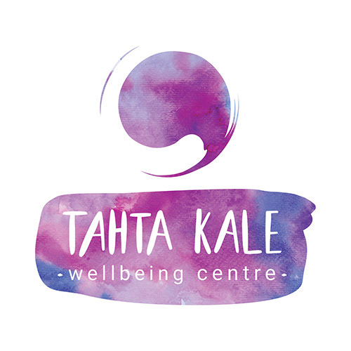
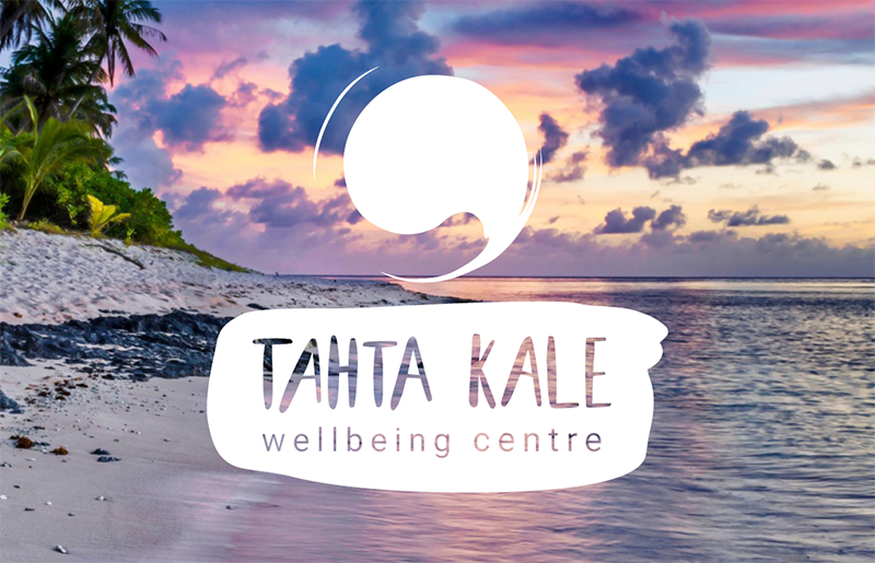
Tahta Kale wellbeing centre is a space aimed to children and adults for maintaining and improving their health. I designed their logo. I played with the Zen symbol and used the negative that leaves over a circle. I used the ink brush stroke for the background of the text part.
I created a secondary options with lighter textures.

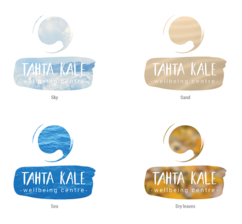
For the main logo colour options I created some watercolour textures. This style has some limitations for its applications but for the nature of the client was okay and was appropriate when being placed among its competitors.

I also did an animation of the logo.

And animated it together with their motto.

I created a flexible brand. I prepared some options with a solid colour background and transparent logo. It could easily be placed on top of textures or images and produce other logo versions.

The idea is that the logo could be branded in line with the style of the visuals prepared for the events - Tahta Kale has a very diverse range of activities and it could benefit from this dynamism.
I also prepared some plain colour options as it could be ideal to play with them over images.
You can also check the video project I did for Tahta Kale.